SIG-Bus’s interface is deliberately compact: each button maps to a step in the analysis workflow, and no field asks for information the plugin can derive on its own. The result is a panel with few actions, all in order.
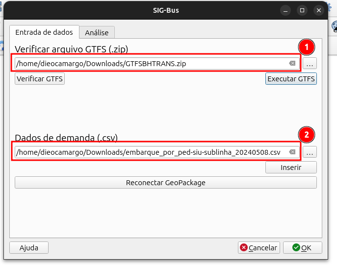
The image above shows the data input screen, for both the GTFS files and the demand files. The example used here is the city of Belo Horizonte, and the data is available at:
The Reconnect GeoPackage button is used when a QGIS project with all the layers already exists and you just need to reconnect it to the plugin to redo the filters.
The two-tab layout
The interface is split into Data Input and Analysis. The division reflects a real asymmetry in the work: preparing the data happens once per analysis; filtering a line, allocating demand, and exporting is where the user iterates until reaching the result they need.
The Data Input tab has three sequential actions:
- Verify GTFS: validates the feed and, when needed, synthesizes a
calendar.txt. Many agencies publish feeds without that file in the conventional format; they use the exception-based mode (calendar_dates), recording each operating date individually. The plugin detects this case and produces a weekly calendar derived from the actual operating dates, saved asgtfs_corrigido.zip. - Load GTFS: converts the feed files to a GeoPackage (
feed.gpkg) and adds the layers to the project. Loading runs in a background thread (QgsTask) to keep the interface responsive while readingstop_times.txt, which is 136 MB in the Belo Horizonte feed. - Import Demand CSV: loads the per-stop boarding data from BHTrans’s SIU system and stores it in a second GeoPackage (
sigt.gpkg).
GeoPackage was a deliberate choice over temporary layers or shapefiles. The .gpkg file persists across QGIS sessions and can be inspected with any SQLite tool, making it straightforward to debug or extend by other systems.
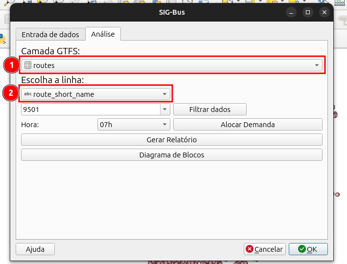
The Analysis tab holds the processing steps: pick the line, set the time window, allocate demand, and generate the report.
Filtering and allocating
In the Analysis tab, the user enters the line’s route_short_name (e.g., 101) and selects a time window (full day or a specific hour, 0h–23h). When confirmed, three operations run in parallel:
- The route shape is highlighted in the
shapeslayer via a subset filter. - The demand is filtered for that line in the
dados_demandalayer. - The
horarios_paradaslayer is built in the background: a join acrossstop_times,trips, andstopsthat shows the departure and arrival times for all trips on the selected route.
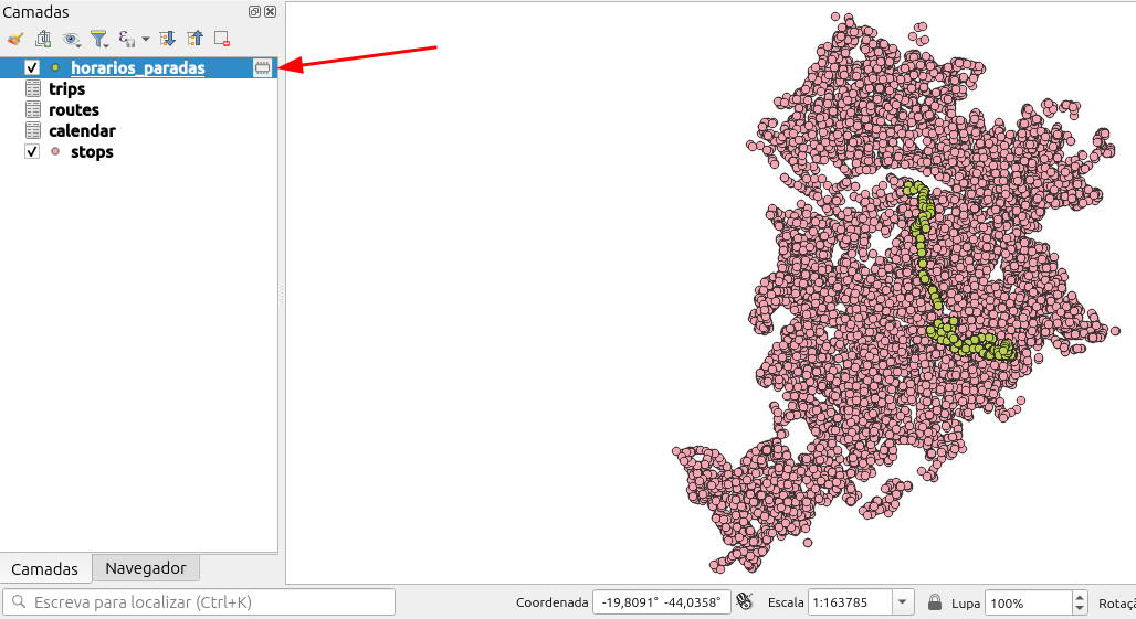
In the map above, only the boarding points for the selected line remain visible, over the highlighted route shape.
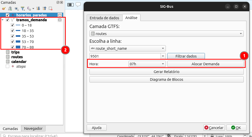
Allocate Demand generates the tramos_demanda layer: one segment per consecutive stop pair, with embarques, passageiros_acum, and n_viagens fields. Load is calculated by accumulation: boardings at stop i add to the running total from previous stops. Since the SIU CSV records only boardings, with no alighting data, the result is an upper bound on actual occupancy, suited for comparing segments within a line and identifying the heaviest-loaded sections.
One relevant implementation detail: SIU demand points have no stop_id. The association to GTFS stops is done by geographic proximity, but the candidate set is restricted to stops on the dominant shape for the selected line and direction, preventing the spatial join from picking up stops from parallel routes sharing the same corridor.
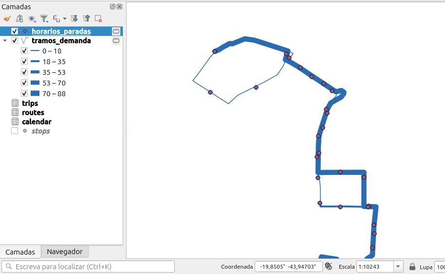
Graduated symbology is applied automatically. Zooming into the route makes the reading immediate: each segment’s thickness grows with its accumulated load, making it visible where the line carries the most passengers.
The PDF report
The Generate Report button exports an A4 landscape PDF, one page per direction. Each page has three elements:
- Load map: graduated symbology on
passageiros_acum, overlaid on the route shape. - Cluster map: K-means grouping of boarding stops, generated by QGIS’s
native:kmeansclusteringalgorithm, with per-cluster symbology. - Bar chart: boardings per stop, drawn directly with
QPainterandQImage. matplotlib is unavailable in a standard QGIS installation, so the chart is rendered through the Qt graphics API.
The report uses QgsPrintLayout, QGIS’s native print layout API. This keeps the plugin dependency-free and integrates the maps already rendered in the project, including their scale and symbology.
The previous post in this series covers the demand allocation model and data structure decisions in more depth. The next part will cover the Block Diagram, the plugin’s fleet scheduling tool.
The repository is on GitHub. The Belo Horizonte GTFS feed for reproducing the analyses is in docs/gtfsfiles.zip.